VitalsSenior Product Designer2025
Standardizing E-Commerce Accessibility Across 1,000+ Custom Shopify Themes
Engineered adaptable UI patterns to meet mobile touch-target standards without breaking legacy storefront layouts.
Product designAccessibility
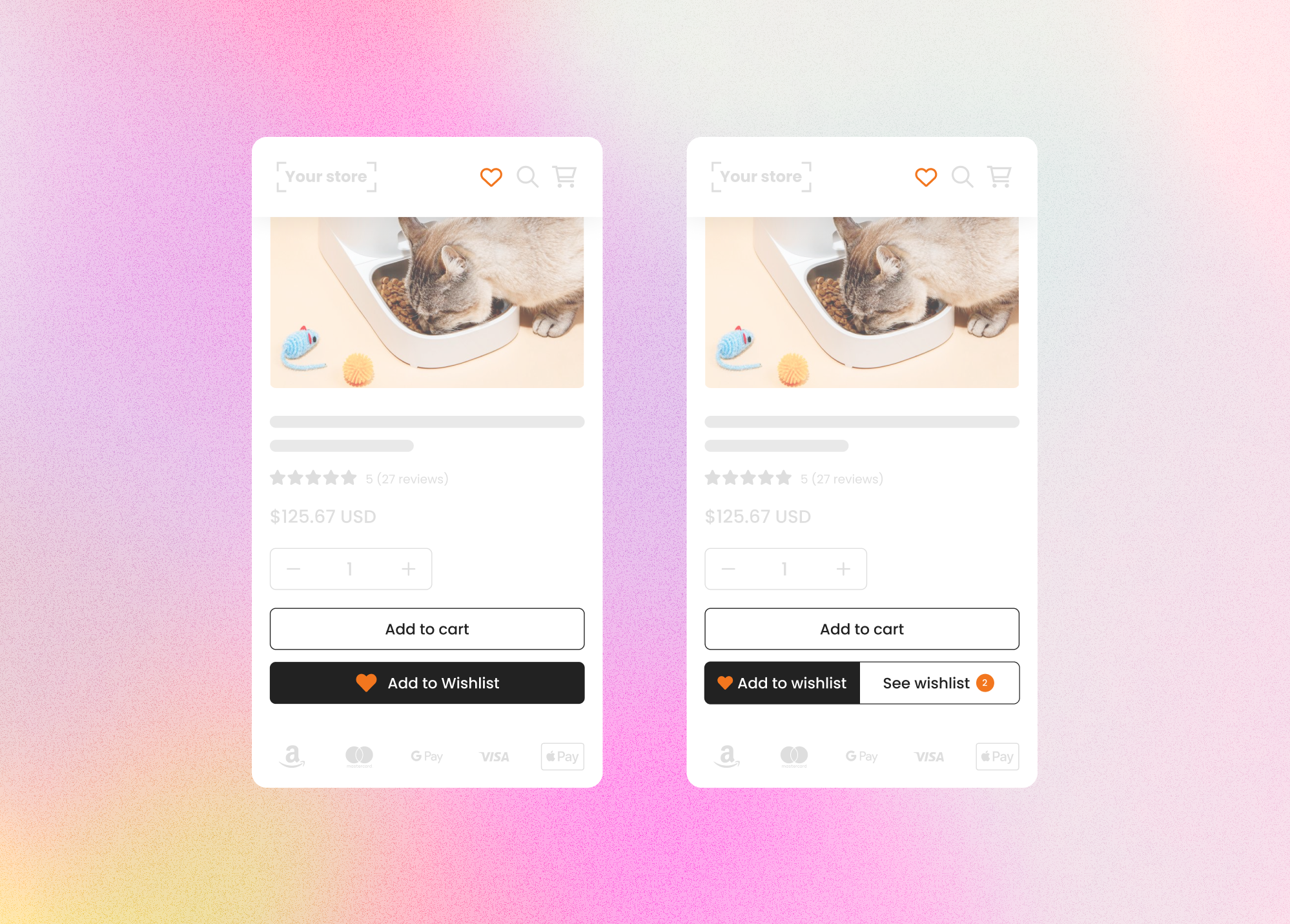
44×44px
Touch target
~80%
Themes working
1 week
Timeline
01
The problem
Vitals' Wishlist icon could be injected into any store header — but the initial implementation had several issues.
- 01Accessibility on mobile: the tap area around the icon was too small. It didn’t meet the WCAG-recommended 44x44px minimum for touch targets, which was especially problematic on mobile devices.
- 02Integration inconsistencies: merchants could install Vitals on multiple storefronts (Shopify and non-Shopify), each with custom themes or code.
- 03Some themes didn’t support proper injection of the icon into headers.
- 04Others didn’t respect accessibility standards or had layout constraints that clashed with the icon’s structure.
02
What I did
Redesigned the icon wrapper for accessibility
- Problem
- The tap area was smaller than the WCAG-recommended 44x44px minimum, hurting tapability on mobile.
- Change
- Increased the icon's wrapper to 44x44px to comply with accessibility guidelines.
- Why
- This improved tapability across most devices and themes.
Customization options for merchants
- Problem
- A single fixed style couldn’t match the range of storefront aesthetics merchants ran.
- Change
- Added settings for merchants to control the icon’s size, color, and badge count display.
- Why
- Ensured design consistency while allowing flexibility across diverse storefronts.
Cross-theme testing
- Problem
- Theme fragmentation meant theoretical compliance wasn’t enough — real stores behaved differently.
- Change
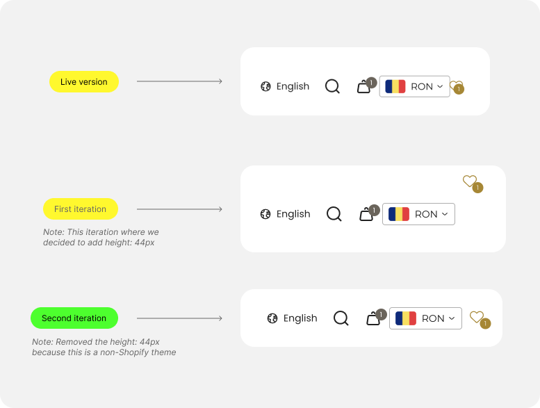
- Tested the updated version on multiple stores; ~80% of themes worked perfectly. In the remaining 20%, edge cases appeared: misalignment where the 44px wrapper didn’t match smaller header icons, overflow and spacing issues where themes didn’t respect the full height, and badge-positioning bugs where the count floated away from the icon.
- Why
- Testing across real stores surfaced the layout tradeoffs that drove the next iteration.
03
Collaboration & tradeoffs
I worked closely with the developer to decide on the next iteration. Here’s how we resolved it.
Set the height to auto instead of a fixed 44px
- Problem
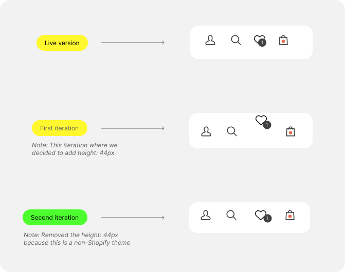
- A fixed 44px height clashed with non-Shopify themes and smaller header icons, causing misalignment and layout shifts.
- Change
- Switched to height: auto, preserving alignment within diverse headers and avoiding clashes for non-Shopify store themes.
- Why
- 70%+ of customers use Shopify themes that already follow accessibility practices, so height: auto reduced bugs for non-Shopify themes and edge cases while keeping the win where it mattered most.
Refined icon + badge structure
- Problem
- In certain layouts the badge count drifted away from the icon, looking broken or unbalanced.
- Change
- Adjusted the internal structure so the badge count stayed visually anchored to the icon.
- Why
- Prevented scenarios where the spacing between the icon and badge appeared broken.
04
Results
The updated Wishlist icon is now:
- 01Accessible on mobile and compliant with touch-target guidelines.
- 02Easier to customize for merchants via the Vitals dashboard.
- 03More resilient across the majority of Shopify themes and some third-party platforms.
05
What I learned
- 01Accessibility fixes can introduce new layout issues when working in third-party environments — which requires design-engineering tradeoffs.
- 02Testing across real stores is crucial; theoretical compliance isn’t enough when dealing with theme fragmentation.
- 03Balancing accessibility, visual harmony, and technical constraints is key when designing UI elements that live inside external codebases.
Theoretical compliance isn’t enough — resilient accessibility in third-party environments is a design-engineering negotiation, not a checkbox.
Next project
Design Systems with a twist at Vitals