Design Systems with a twist at Vitals
Building a design system that had to live inside thousands of storefront themes it did not control — flexible enough to adapt, strict enough to stay consistent.
40+
Apps served
2 of 2
Dev teams adopted
2 years
Timeframe
The problem
Why do we need a design system, and what were we trying to solve?
- 01Inconsistent UI and UX: designers and developers worked without a central design system, and the lack of standardization produced an ever-growing number of settings for similar components.
- 02Difficulty maintaining and scaling: complexity grew as variations multiplied without a central system, design debt accumulated, and limited patterns hindered new features and growth.
- 03Onboarding challenges: new team members struggled to grasp the design language and coding practices, and repeatedly explaining the rules to each new developer was inefficient and unsustainable.
- 04Communication gaps: the absence of a system led to frequent misunderstandings and misaligned expectations between teams about how features should look and function.
The opportunity
"Design isn’t just about how something looks but how it works." — Airbnb
A shared system was a chance to make consistency, accessibility, and speed the default — and to give non-designers and engineers a common language to build with.
The challenges
The twist: the system had to live inside storefronts we did not control.
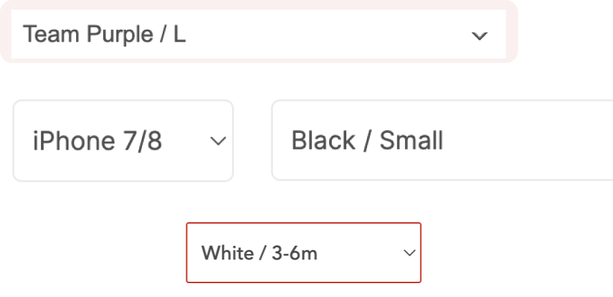
- 01Everything had to be accessible, yet users still needed to customize settings to their preferences. Auditing stores surfaced repeated issues with the colors used for Add to Cart buttons, text, and backgrounds.
- 02Store themes carry countless styles, colors, and typography choices, but apps must seamlessly align with each store's design — Shopify theme or not.
- 03We could not use hardcoded values, font families, or font weights, because the apps had to stay consistent with every other section of the store.
- 04Vitals is a large project built with multiple technologies, so components could not be applied universally across all apps.
- 05Every new component and variable had to maintain backward compatibility — and getting management buy-in for a design system was itself a challenge, as there was never an "opportune" moment to start.
First steps
- 01Research: audited established design systems, including Shopify’s and major store themes, to learn what to align with.
- 02Colors: defined a tailored, token-based approach so components could inherit each store’s palette instead of hardcoding values.
- 03Good practices: documented naming conventions and usage rules to make the system approachable for designers, engineers, and non-designers alike.
- 04Components: built Figma components and tokens, then partnered with engineers on implementation with backward compatibility.
Risks
- 01Components that don't suit every theme: with such a diverse range of themes, a one-size-fits-all approach isn't feasible, so the system had to stay flexible enough to adapt to each theme's style, color, and typography.
- 02Lack of adoption from the development team: a system only works with buy-in, so it had to be user-friendly, well-documented, and clearly beneficial to encourage widespread use.
- 03Dependence on management support: success required allocated resources, training, and a culture that values design consistency, plus long-term commitment to maintenance and evolution.
Rabbit holes & KPIs
I stayed alert to the traps — many iterations and constant updates, and teams’ natural resistance to changing their rhythms — and tied success to measurable signals.
- 01Team efficiency: how long it takes to build a new product using the system.
- 02Speed to market: how long it takes to build and test prototypes.
- 03Effect on code: lines of frontend code changed per release, before and after launch.
- 04Adoption in code: how well adopted the system is across the codebase.
Out of scope (for now): AI integration that would let PMs, marketers, and the CEO generate new screens without knowing Figma or code.
Results & impact
- 01Adopted across 40+ internal apps by both development teams, improving consistency and reducing maintenance overhead.
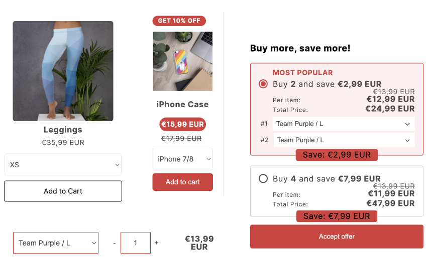
- 02Centralized key components — buttons, variant selectors, and quantity selectors — making accessibility updates scalable across the platform.
- 03Improved engineering velocity by documenting components and tokens, reducing design-to-dev clarification and rework.
- 04Reduced design debt by eliminating inconsistent spacing, typography, and color patterns inherited from legacy themes and early-stage chaos.
- 05Boosted internal engagement: naming conventions made the system approachable and encouraged usage from non-designers and engineers.
- 06Still in progress: the system continues to evolve as the team scales.
Next project
Cart Drawer – smoother, faster ecommerce UX