Omni Limousine: Driving direct bookings through a premium web experience
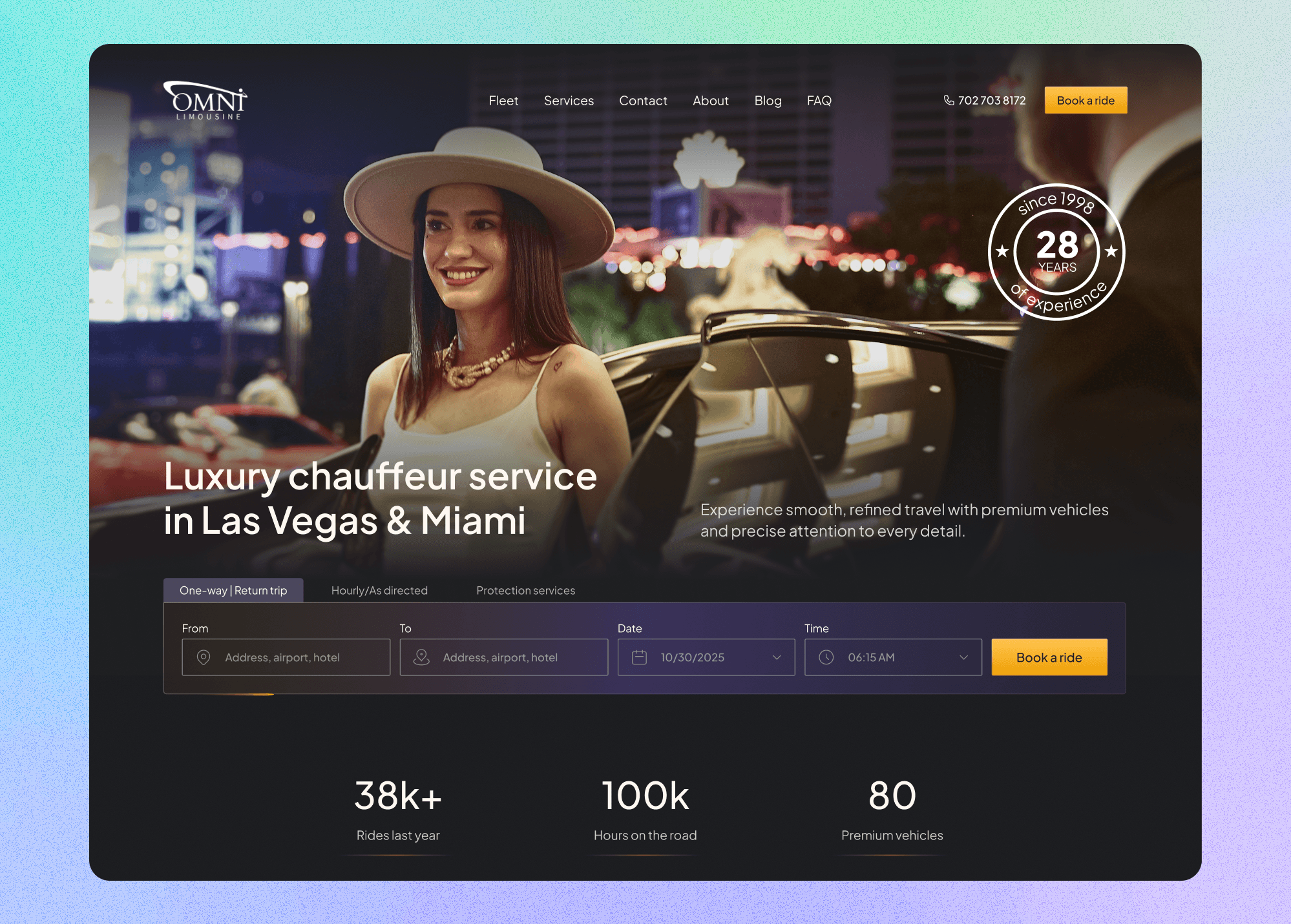
Redesign and Webflow build of the web experience for a premium chauffeur service in Las Vegas and Miami, turning a static brand site into a direct-booking channel.
+20%
Direct bookings (target)
UX, UI & Webflow
Scope
Las Vegas & Miami
Markets
Overview
Omni Limousine has run a premium chauffeur service since 1998, but almost all of its bookings came through partnerships — hotels, concierges, referrals — rather than its own website.
The old site looked dated, didn’t reflect the quality of the real-world service, and wasn’t built to convert. I redesigned and rebuilt it in Webflow around one goal: turn the website into a direct-booking channel, with booking reachable from anywhere on the site.
Because the previous site collected no analytics and the new one launched without instrumentation, this case study is about the problem, the decisions, and the craft — not a measured lift. I’ve kept the line between result and hypothesis explicit throughout.
The problem
Omni’s reputation lived offline. Repeat clients and partners knew the service was reliable and discreet; new customers landing on the website saw none of that. Two problems compounded:
- 01The website wasn’t a booking channel: Direct web bookings were a small share of volume; the business leaned on partnership referrals. Growing direct bookings meant the site had to build trust and remove friction on its own.
- 02The brand read as neither premium nor approachable: The old design looked like a generic black-and-white chauffeur template. It didn’t signal luxury, and it didn’t feel welcoming to the broad audience Omni actually serves — event guests, business travelers, and families, not only executives.
The target set for the project was a 20% increase in direct web bookings. To be precise: that was the target the design worked toward, not an outcome I can claim.
My role and constraints
I was the only designer, and I also built the site, owning the UX, UI, content structure, and Webflow implementation end to end. The booking flow (its steps, fields, states, and logic) was my design; a backend developer wired the resulting widget into Omni’s reservation platform.
Two constraints shaped the work:
- 01A fixed booking platform: The reservation back-end was a given, so I designed the flow around what it could support rather than in a vacuum.
- 02No baseline: With no analytics on the old site, I had nothing to diagnose from. I worked from the booking platform’s structure, competitor patterns, and a set of explicit behavioral assumptions that I treated as hypotheses to design against, not as facts.
Approach
I anchored the redesign in three core principles:
- 01Approachable luxury: Omni serves a wide audience, so the site had to feel premium without being intimidating or exclusive. In practice that meant clean layouts, clear and literal language, readable typography, and straightforward service explanations — luxury you don’t have to decode.
- 02A visual identity built on Las Vegas at night: To break from the generic black-and-white chauffeur look, I built the palette around the city where Omni operates best: deep charcoals for a cinematic base, purple gradients evoking dusk over the strip, and gold accents for warmth and signal. The intent was instant recognizability and clear differentiation from competitors.
- 03Book from anywhere: If the site was going to become a booking channel, booking couldn’t sit on one buried page. I placed an above-the-fold booking widget on the homepage and booking entry points throughout — in the hero, on fleet cards, inside service descriptions, and beside social proof — so the shortest path to a reservation was always one click away.
The booking experience
This was the center of the project.
Shift from isolated flow to omnipresent entry point
- Problem
- The old booking flow was a six-step, single-purpose journey — Reservation, Vehicle, Options, Passenger, Payment, Confirmation — that lived on its own page, disconnected from the rest of the site.
- Change
- Reframed booking as something available everywhere, starting with an above-the-fold homepage widget that opens the flow immediately.
- Why
- A customer no longer has to hunt for the booking page; the entry point is available the second they land or browse any service.
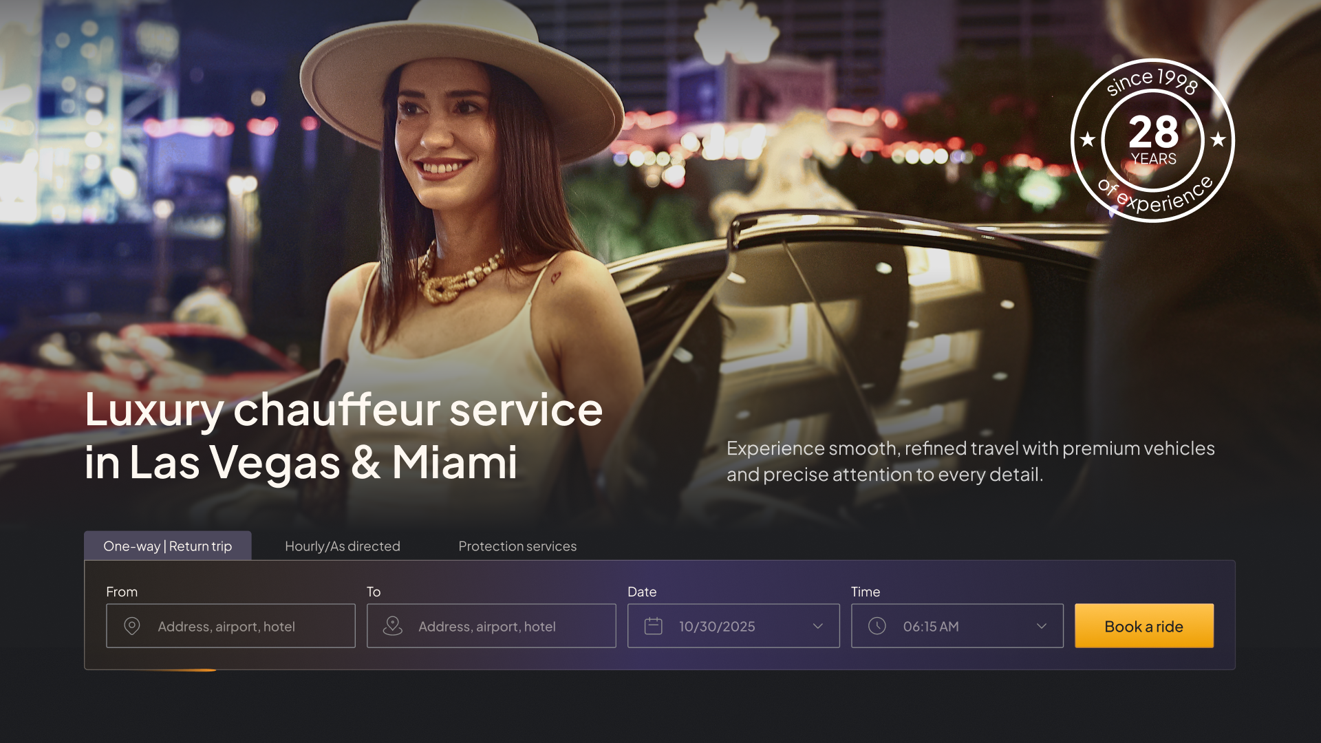
The homepage hero widget puts booking front and center with minimal initial friction. Trip-type first initialization
- Problem
- Users faced overwhelming form fields right at the start before defining their core intent.
- Change
- The trip type is chosen up front (one-way / return, hourly / as-directed, and security services), revealing only essential fields to start — pickup, drop-off, date, and time.
- Why
- Reduces cognitive load and allows the reservation to progress naturally into vehicle and detail selection.
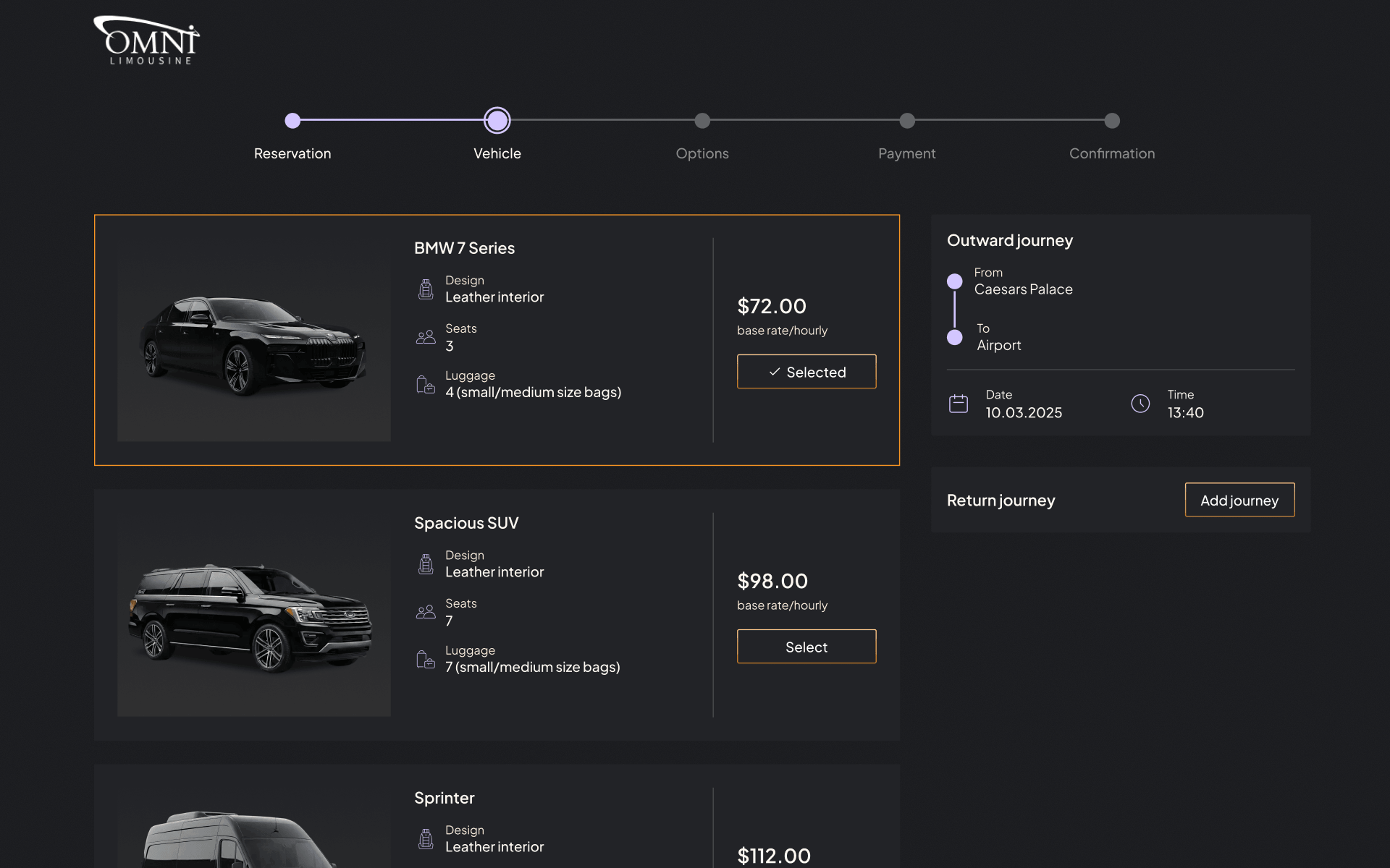
Optimized for mobile users who frequently book close to pickup. Designing edge cases and error states
- Problem
- Traditional booking forms fail silently or obscurely when inputs are invalid, causing drop-offs.
- Change
- Designed explicit states for empty fields, invalid inputs, and moments where a booking can stall.
- Why
- Designing for where a flow breaks is what makes it a dependable product rather than just a web form.
Designing and building it in Webflow
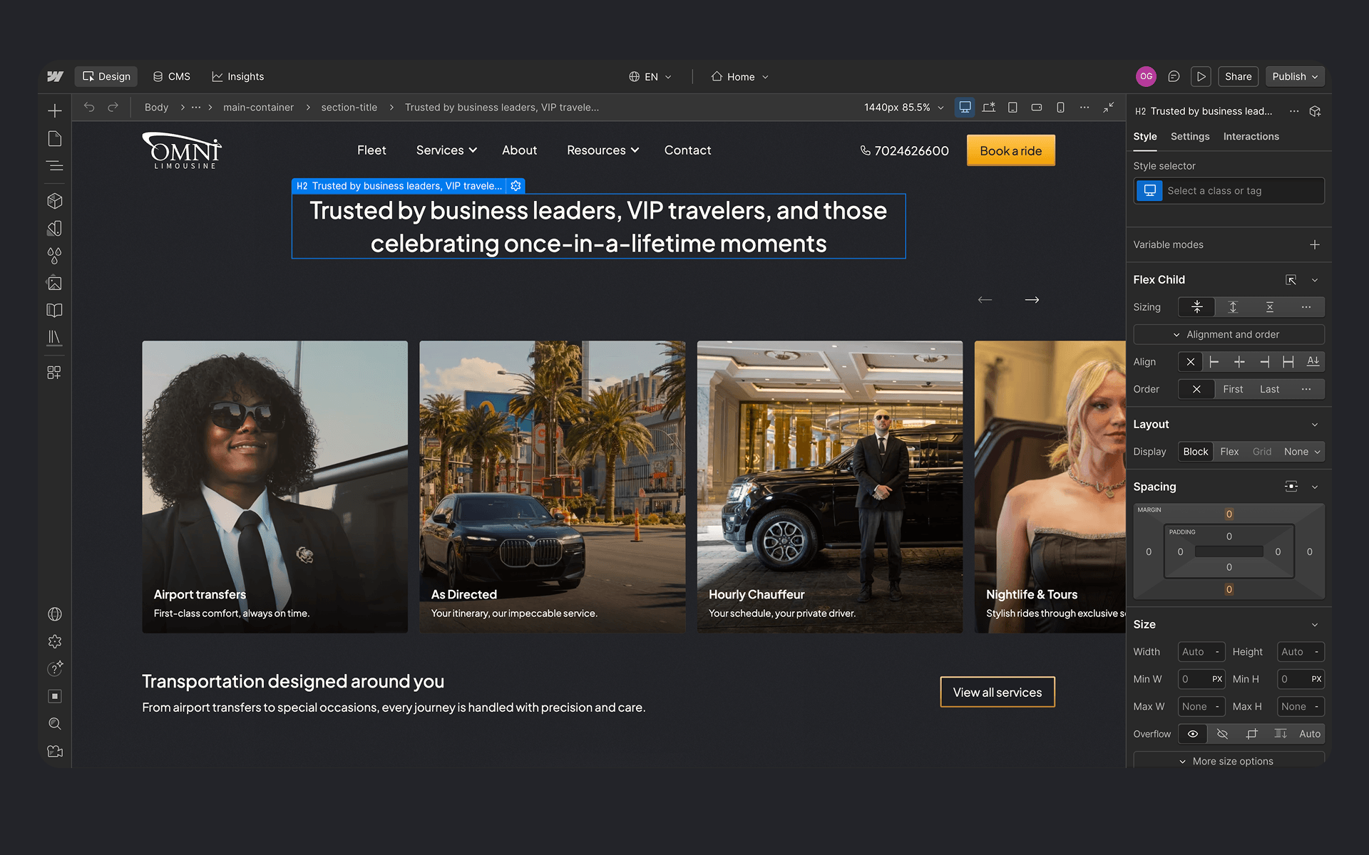
I built the entire site in Webflow, not a design handed off to someone else. That meant translating the system into real, responsive components, wiring the CMS, and collaborating with the backend developer at the one seam where my booking UI met Omni’s reservation platform.
Owning both design and build kept the shipped product faithful to the intent and let me iterate directly instead of through a handoff round-trip.
Outcome and how I’d measure it
The honest version: there are no performance metrics. The old site tracked nothing, so there’s no baseline; the new site shipped without analytics, so there’s nothing to compare against yet. I won’t present a target as a result.
What I’d do now — and would prioritize on any similar project — is make it measurable from day one:
- 01Instrument the booking funnel end to end: widget opens, step completions, drop-off points, completed reservations.
- 02Define the success metric explicitly: direct web bookings, and homepage-to-booking conversion rate against the 20% target.
- 03Validate behavioral assumptions with real data: are guests actually booking on mobile and close to pickup? — and let the findings reshape the flow.
Reflection
The craft holds up. The site looks premium, stays approachable, and puts booking one click away from anywhere, but "designed to convert" and "converts" are different claims, and I don’t want to blur them. On the next project, measurement is a first-class design requirement, not an afterthought.