Restructuring MediDrive’s state NEMT pages
A multi-audience information architecture redesign for Colorado and Virginia NEMT pages — segmenting member, facility, and provider paths, introducing a WCAG 2.1 AA-audited component system, and standardizing accessible downloadable forms.
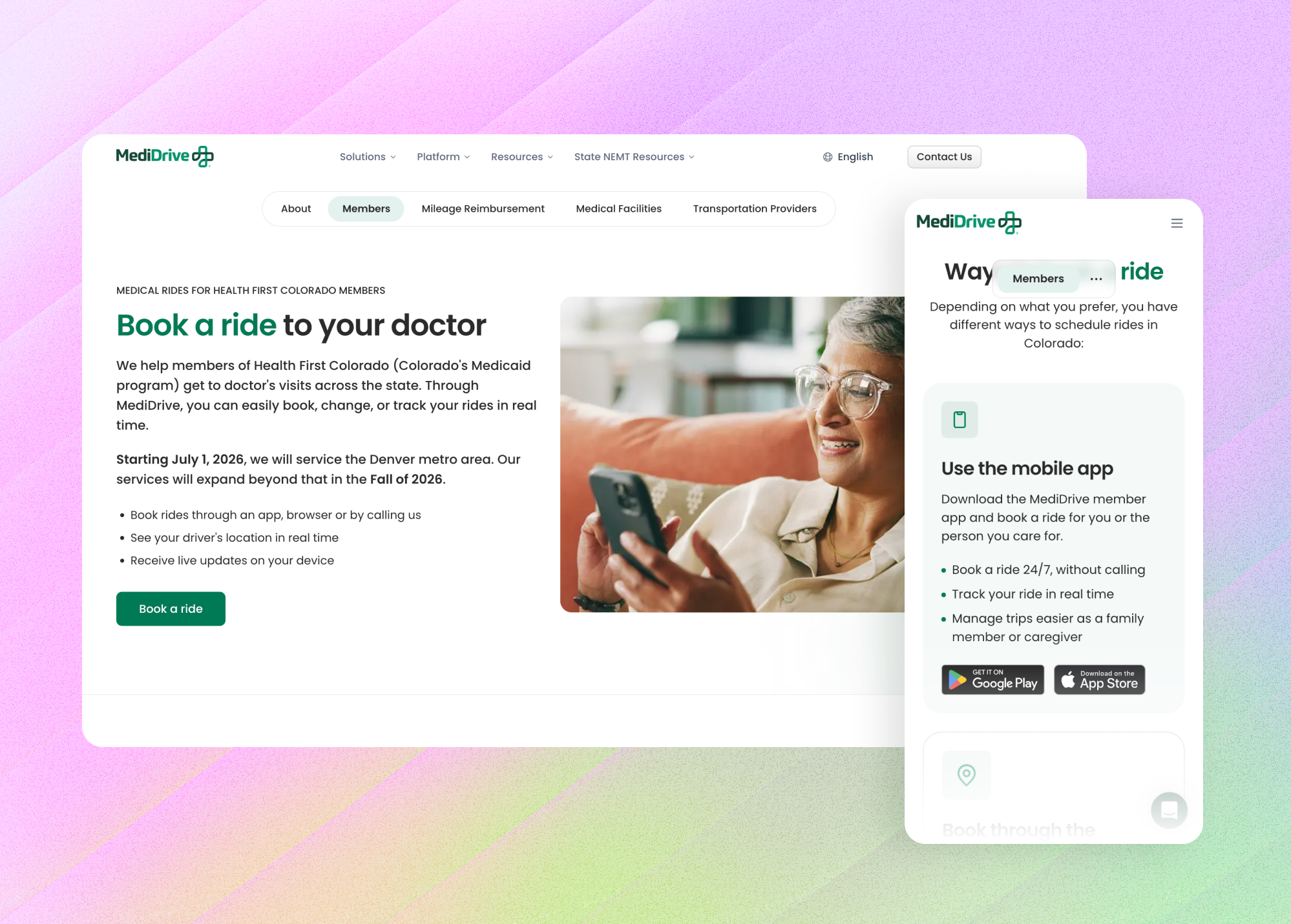
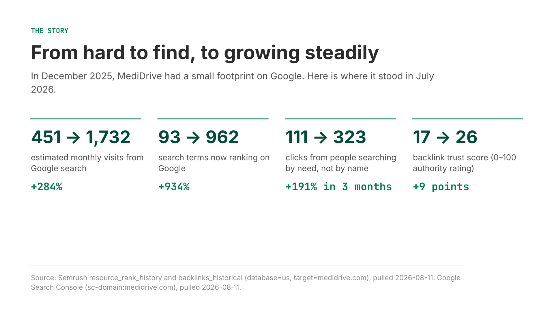
Our state NEMT traffic jumped +280% in just a few months. I built a clear, multi-audience layout to make sure thousands of members, facilities, and providers could easily self-serve instead of calling support.
WCAG 2.1 AA (ACR Produced)
Accessibility Audit
3 Dedicated Routes
Audience Paths
Colorado & Virginia
State Coverage
Context
MediDrive provides non-emergency medical transportation (NEMT) for Medicaid members. Its state resource pages are not single-audience pages — they must simultaneously serve three distinct user groups, each arriving with a different intent:
1. Members and caregivers: Skewing older, often with lower digital literacy, seeking immediate reassurance to two core questions: Am I covered, and how do I book a ride?
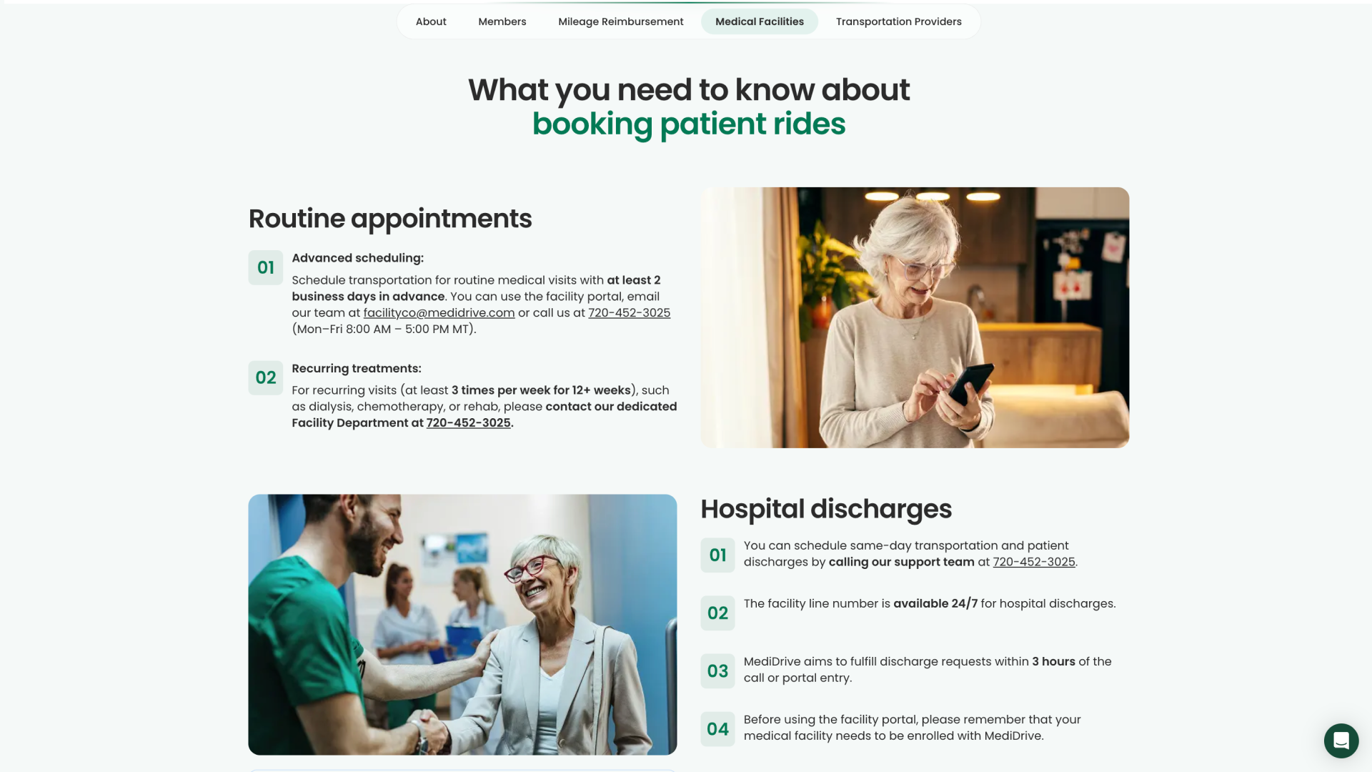
2. Medical facilities: Hospital and clinic staff scheduling rides on behalf of patients who need fast, explicit processes and requirements.
3. Transportation providers: Logistics partners evaluating or managing operational relationships.
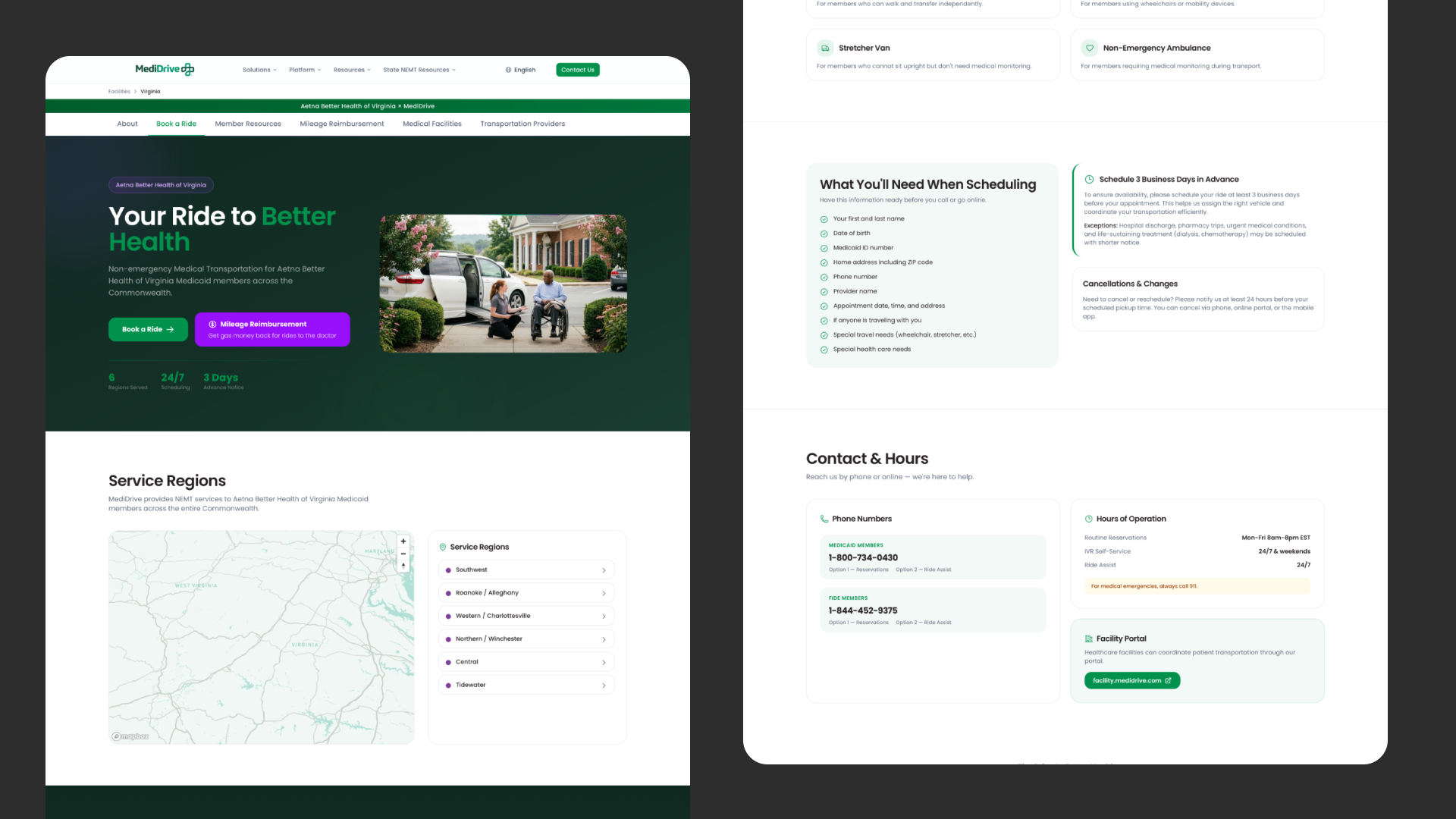
The previous pages treated everyone identically through a single, operations-first layout. The design looked finished on the surface, but it buried member tasks under operational details, featured a non-functional interactive map, and front-loaded advance-notice restrictions that acted as immediate barriers to care.
The core design challenge
Serving members, facilities, and providers on shared state pages is a structural information architecture problem, not a copy refresh. The three groups operate in entirely different registers:
Members need plain-language reassurance and clear steps. Facility schedulers need rapid rules and forms without hand-holding. Transportation providers need partner mechanics. Get the architecture wrong, and you either bury the member route under operational complexity or dilute the professional tooling needed by staff.
The legacy design failed because it treated members as an afterthought. To fix this, I established the member route as the primary path, anchored against an explicit user persona: an older Medicaid member (frequently 60s–80s), often viewing zoomed text on mobile devices, and unfamiliar with complex digital conventions.
- 01Undifferentiated layout: Members, clinic staff, and drivers were forced through the same dense text blocks.
- 02Misplaced operational friction: A "3 days' advance notice" requirement was front-loaded near the hero, reading as a denial of service before members could evaluate coverage.
- 03Phone-first bias: Support phone numbers were prioritized while self-serve digital tools were hidden inside generic, unformatted cards.
- 04Accessibility barriers: Low-contrast hero metrics (WCAG 1.4.3 failure risk) and unstandardized downloadable PDF forms.
Working Benchmark: I designed the member path against the digital literacy of older family members. If an interface step assumes unprompted web fluency or hides critical actions behind decorative elements, it fails.
Principles
Three architectural principles guided the multi-audience restructuring:
- 01Segment early, route explicitly: Identify the visitor’s job immediately and offer dedicated tracks rather than a single unified scroll.
- 02Protect the member path: The primary route belongs to the most vulnerable user; professional tooling must never crowd out member reassurance.
- 03Accessibility through the entire ecosystem: Extend WCAG 2.1 AA compliance beyond web components to include printed and downloadable PDF artifacts.
The redesign
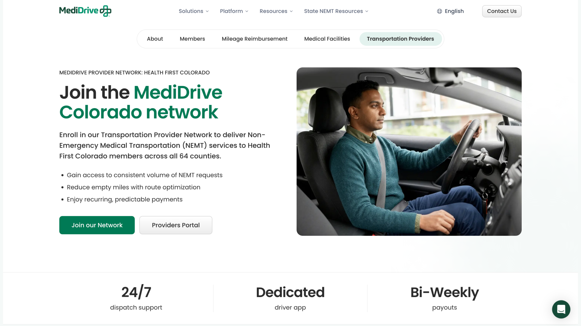
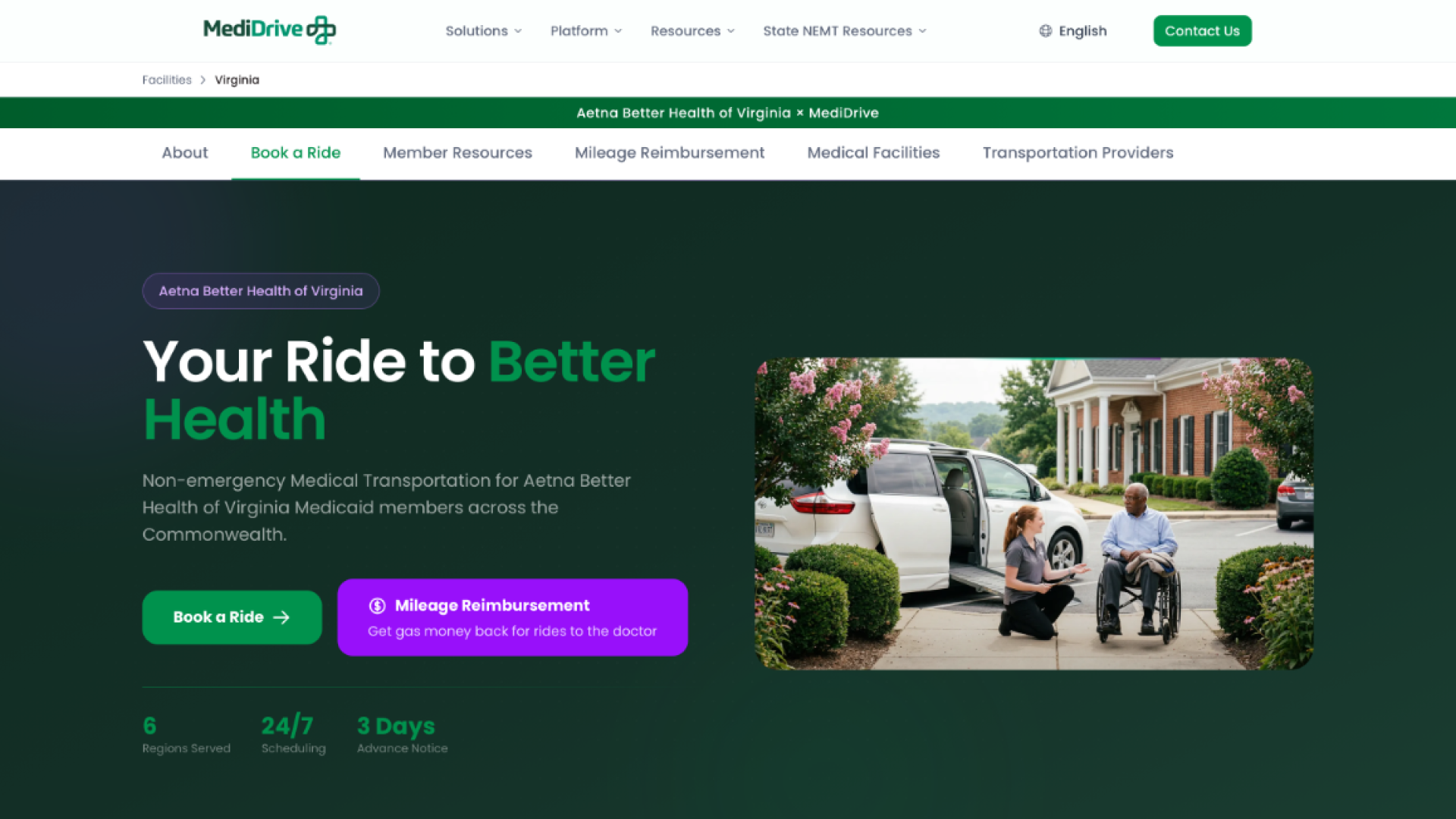
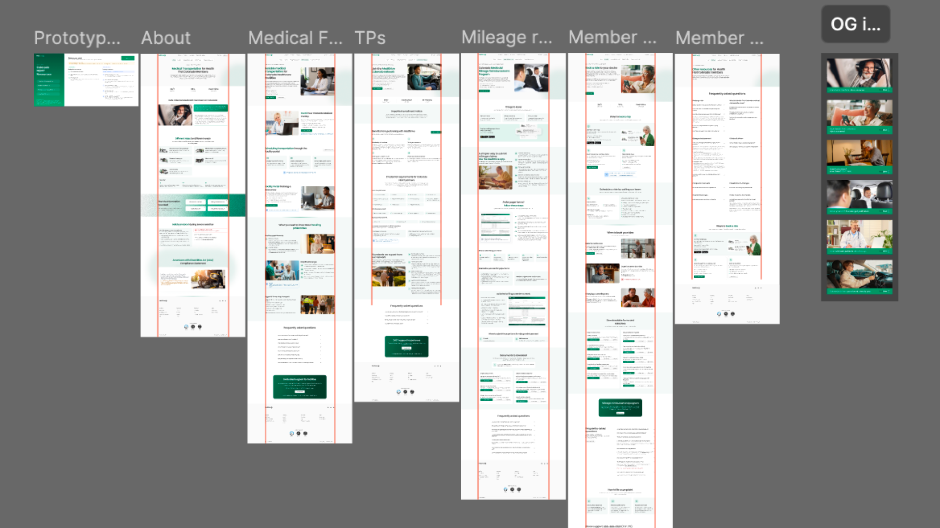
I restructured the page architecture into a reusable state framework, deploying it across Colorado (Health First Colorado) and Virginia (Aetna Better Health of Virginia).
Explicit audience segmentation & routing
- Problem
- Visitors had to manually scan dense operational documents to locate relevant instructions.
- Change
- Introduced a "Find the information you need" routing section directly below the hero, immediately bifurcating members, medical facilities, and transportation providers into tailored tracks.
- Why
- Eliminates cognitive overload for older members while giving professional staff direct access to operational workflows.
Need-first ride categorization
- Problem
- Ride options were listed using industry taxonomies like "Ambulatory" or "Levels of Service".
- Change
- Replaced rigid lists with a scannable "Different rides for different needs" grid that leads with familiar vehicle types ("Standard cars") and demotes technical terminology to parentheticals.
- Why
- Matches the member’s mental model and reduces reading friction for non-technical users.
Self-serve priority with protected human fallback
- Problem
- Call centers were overloaded because web and app booking options were obscured.
- Change
- Positioned 24/7 web and mobile app booking as the primary actions while maintaining a dedicated "Prefer to speak with someone?" phone section.
- Why
- Drives self-service efficiency without removing essential phone support for lower-literacy members.
Systematizing accessibility (web & forms)
Accessibility was treated as core architecture rather than a post-launch audit requirement across both digital and printable touchpoints:
- 01Web DOM Conformance: Audited all five Colorado public pages against WCAG 2.1 AA via live DOM inspection. Produced an official Accessibility Conformance Report (ACR) documenting 42 Supports, 8 Partially Supports, and 0 Does Not Support across 50 applicable success criteria.
- 02Downloadable Form Standardization: Extended accessibility compliance to printable member/caregiver PDF forms, enforcing standardized color palettes with WCAG 2.1 AA minimum contrast ratios (4.5:1 body text, 3:1 large text).

Accessibility standards: WCAG 2.1 AA compliant color tokens applied across web components and printable PDF forms. - 03Structural ADA Integration: Integrated a dedicated ADA compliance section into the page architecture, surfacing accessibility assistance options explicitly.
Audit Distinction: Rather than asserting untested compliance, the project produced a formal Accessibility Conformance Report (ACR) based on live DOM evaluation with a documented remediation log.
Impact & performance
The restructuring established a robust operational foundation as MediDrive launched state-level partnerships:
- 01High-volume core page: Coinciding with MediDrive’s launch as Colorado’s Medicaid NEMT partner in July 2026, the redesigned Colorado page became the most-trafficked surface on the site (~3,585 clicks in July 2026, up from 622 in June; Google Search Console).
- 02Multi-audience scalability: The underlying design system patterns successfully accommodated both Colorado and Virginia state requirements without custom layout hacks.
- 03Search findability alignment: Non-branded search traffic grew +191% over a three-month launch window (GSC, May–July 2026), supported by plain-language audience segmentation and structured HTML hierarchy.
Reflection
Designing for public health access requires balancing strict operational requirements with deep empathy for vulnerable users. Removing decorative UI elements — such as the non-functional interactive map — reinforced a core principle: every element on a high-stakes resource page must earn its place by helping a user take their next step.
Structuring information for multi-audience surfaces proved that clarity is achieved through intentional routing, not by omitting necessary details. By protecting the member path while providing clear tracks for professional partners, the redesign delivers an equitable experience across all user groups.