MediDrive: Scaling Accessibility Across an Enterprise Healthtech Ecosystem
How a design system built as governance infrastructure made a consistent, accessible redesign of a NEMT member portal and app possible at ecosystem scale.
15–20%
Avoidable support calls (target)
WCAG 2.1 AA
Accessibility standard
Portal + App
Surfaces redesigned
Context
MediDrive is a US non-emergency medical transportation (NEMT) service. Its members are largely Medicaid beneficiaries aged 65+, many with low digital confidence, and a significant share of bookings are made on behalf of a member by a caregiver or facility staffer.
The platform is not one product — it's an ecosystem of portals serving different audiences: medical facilities, transportation providers, members, and dispatchers. Each has a different job, but they all sit on the same underlying booking and trip data.
This case study focuses on the member surface: a web portal and a mobile app for booking, managing, and tracking medically necessary rides plus mileage reimbursement. The design system was built to serve all of those portals, which is the reason it exists at all.
The problem
The existing product carried the assumptions of the operation that built it, not the people using it.
- 01The portal was built for dispatchers, not members. The trip list was laid out for staff scanning across many members, so members reading their own trips had to parse a table designed for someone else’s job.
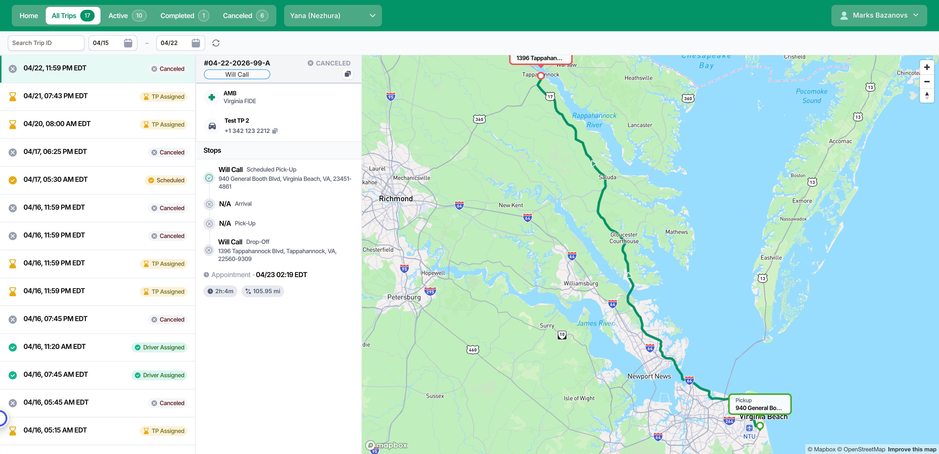
The original console — a dispatcher tool members were expected to read as their own trip list. - 02Members were dropped straight into a booking form after login, with no guidance that their first step was to add a member — and no signal that the account they created wasn't the member's.
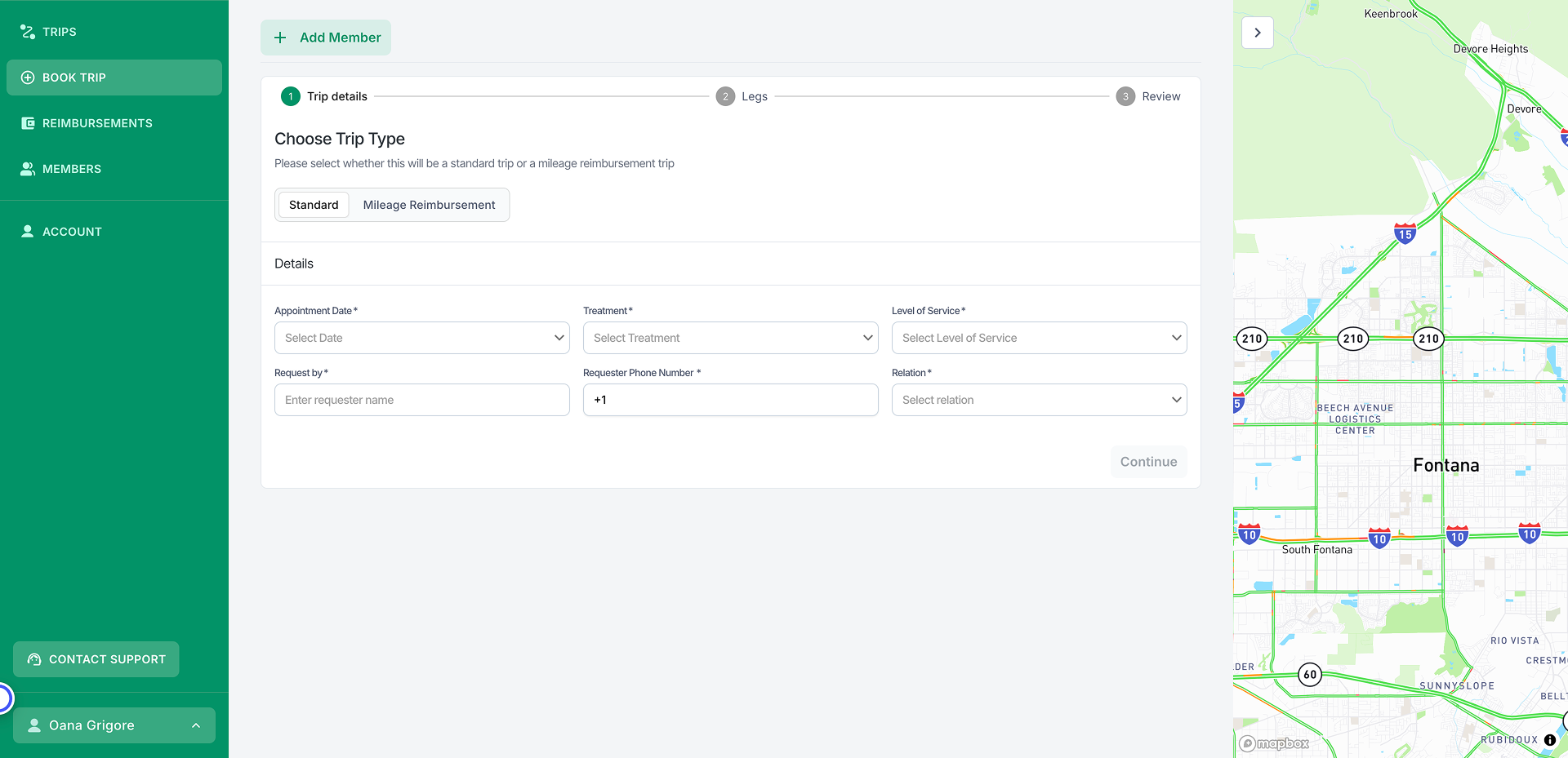
Login dropped members directly into a booking form — no guidance that the first step was to add a member, and no signal the account wasn’t the member’s. - 03The booking form was one-size-fits-all. The same fields appeared whether the trip was one-way, round trip, or multi-leg, and errors surfaced after submission — so a caregiver booking on behalf of someone had no confirmation of who the trip was for until it was too late to fix cheaply.
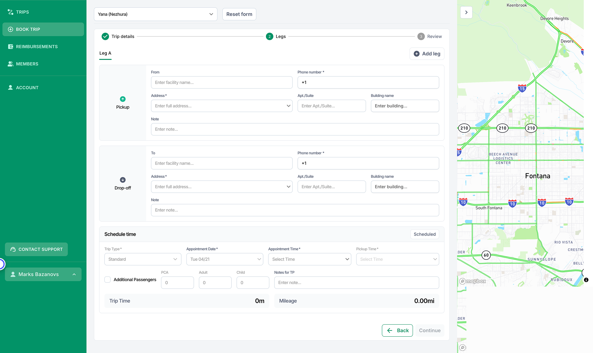
One form for every trip type, with errors appearing only after submit — so a caregiver booking for someone else had no confirmation of who the trip was for until it was too late to fix cheaply. - 04There was no design system. Colors, components, and patterns were inconsistent across surfaces, so every new screen re-litigated basic decisions and accessibility was applied case by case.
- 05The audience amplifies every one of these. For a 65+ Medicaid population, the cost of a confusing flow isn't a bounce — it's a missed medical appointment and a call to a support line.
The strategic problem underneath all of this: you cannot redesign two surfaces consistently, accessibly, and at multi-brand scale by hand-crafting screens. The bottleneck isn’t design taste, it’s the absence of a system and a governance model — so I sequenced the work accordingly.
The strategic bet: system first
The decision that shaped everything: build the design system as the governance layer before redesigning at scale, so consistency and accessibility become structural instead of discretionary.
The forcing function was the ecosystem itself. With separate portals for facilities, providers, members, and dispatchers, there is no way to keep the experience coherent — or to change one color, component, or contrast ratio once and have it hold everywhere — without a shared token layer they all consume. A per-portal approach would have re-litigated the same decisions four-plus times and guaranteed drift.
This is deliberately an outcomes-over-output framing: the system's job isn't to produce more components faster — it's to make “consistent and accessible” the path of least resistance for everyone building on it, including a dev team I don't manage.
What I built: the design system
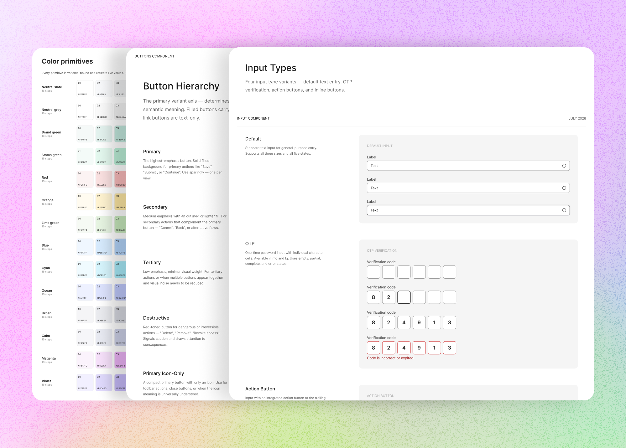
The system is a two-tier token architecture, primitives resolving into semantics, following standard atomic design and token practice.
- 01Primitives hold every raw value. They carry no meaning and are never referenced directly in components.
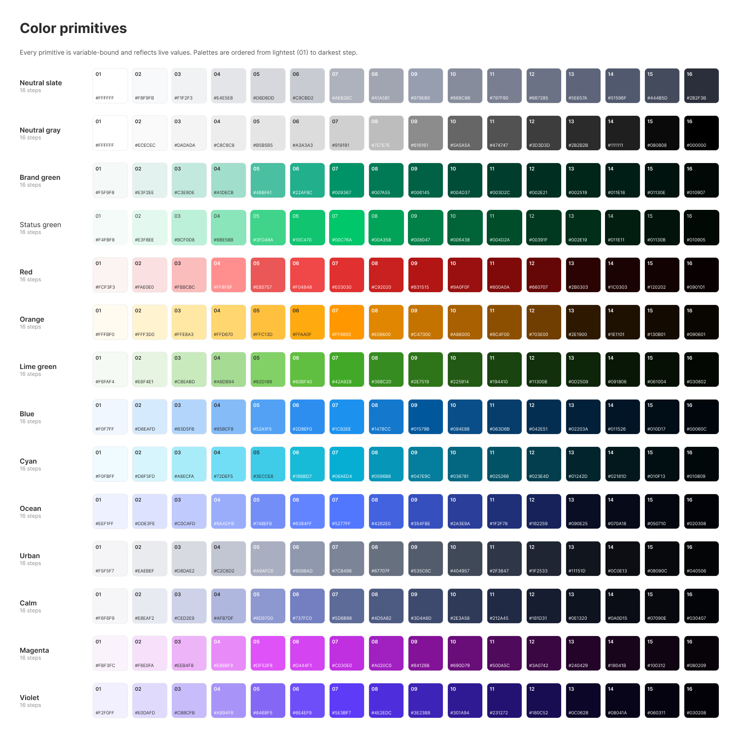
The list of primitive colors - 02Semantics alias primitives to a role. No semantic token holds a raw hex; it always points to a primitive. This is the governance mechanism, not a nicety — theming, dark mode, and rebrands change one layer, and component authors physically cannot hardcode a value that escapes the system.
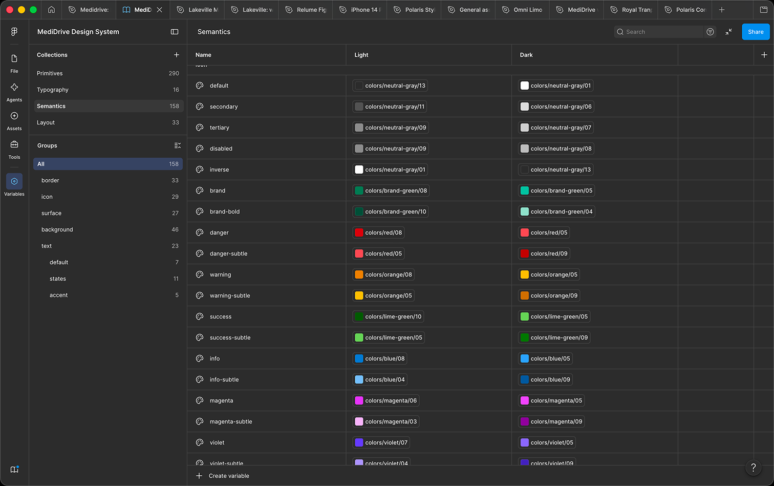
Semnatics alias. - 03Light and dark modes resolve through the semantic layer, so a token never fails to resolve for a developer.
- 04Accessibility is baked into the tokens. WCAG 2.1 AA was applied to color and component decisions at the token level. Contrast is a property of the system, not a per-screen check.
- 05A single icon component set keeps icon usage consistent and swappable.
How the system enabled the redesign
With the system in place, the redesign became a series of decisions grounded in members and caregivers reality.
Unified sign-in with a member-first first run
- Problem
- Conventional sign-in forces users to know in advance whether they already have an account, and onboarding usually starts with account administration rather than the reason they came.
- Change
- One entry point takes an email or phone number; the system recognizes the person and routes returning vs. first-time users automatically. For a first-time user, the very first step is adding the member who needs transportation, with support for multiple members, then booking a first trip immediately.
- Why
- It removes a decision the audience shouldn’t have to make and orders onboarding around the real goal — getting a ride booked — instead of account setup.
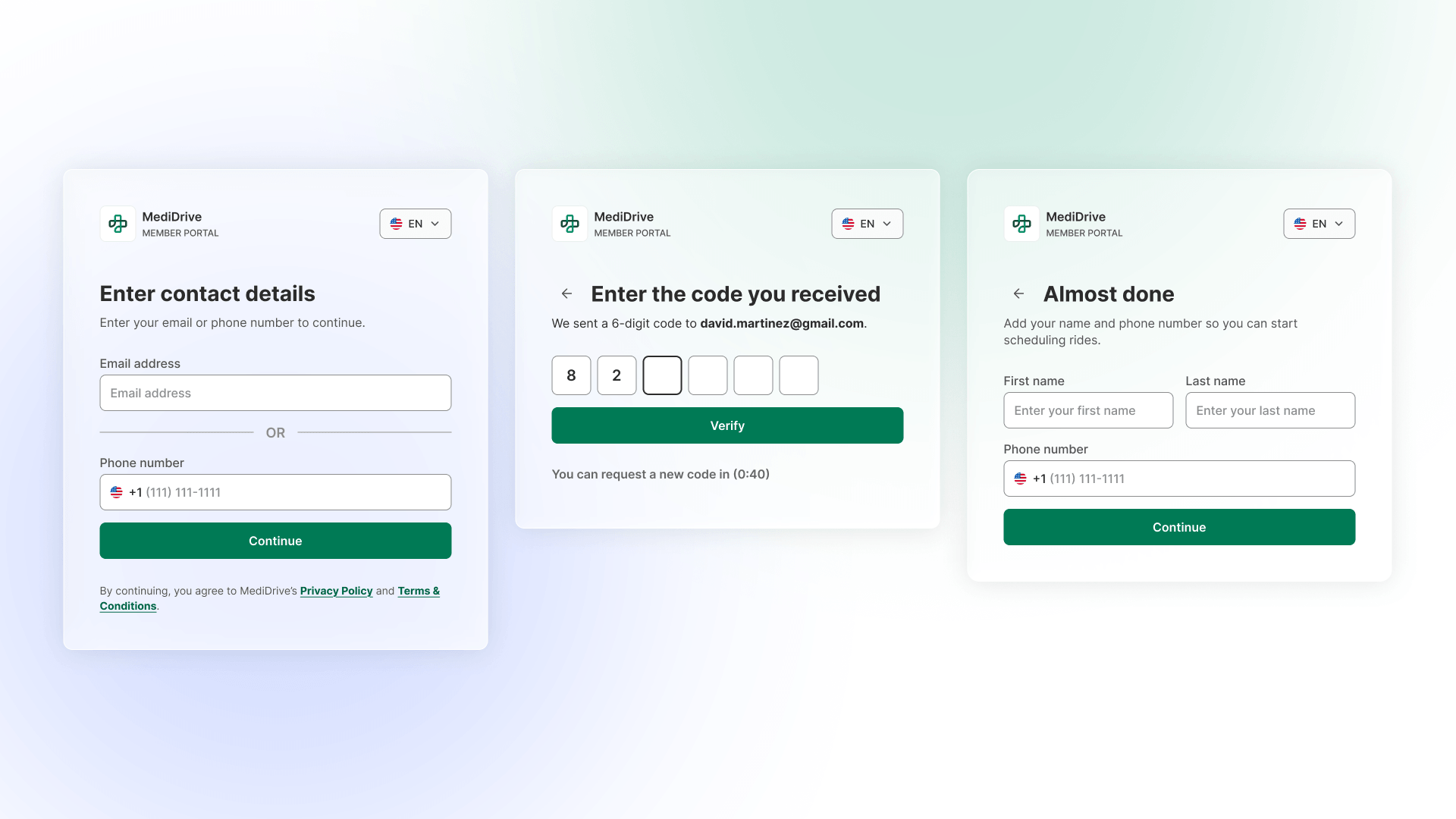
One entry point — email or phone. Returning and first-time members are routed automatically, so no one has to know in advance whether they have an account. Dashboard as the landing surface
- Problem
- Login dropped members into a booking form with no context.
- Change
- Members now land on a dashboard; if a trip is active, driver details and pickup time are front and center, with shortcuts to trip history, reimbursements, and addresses.
- Why
- It answers the highest-anxiety question first, so most members never navigate further. Booking starts when the member decides to book — not the instant they log in.
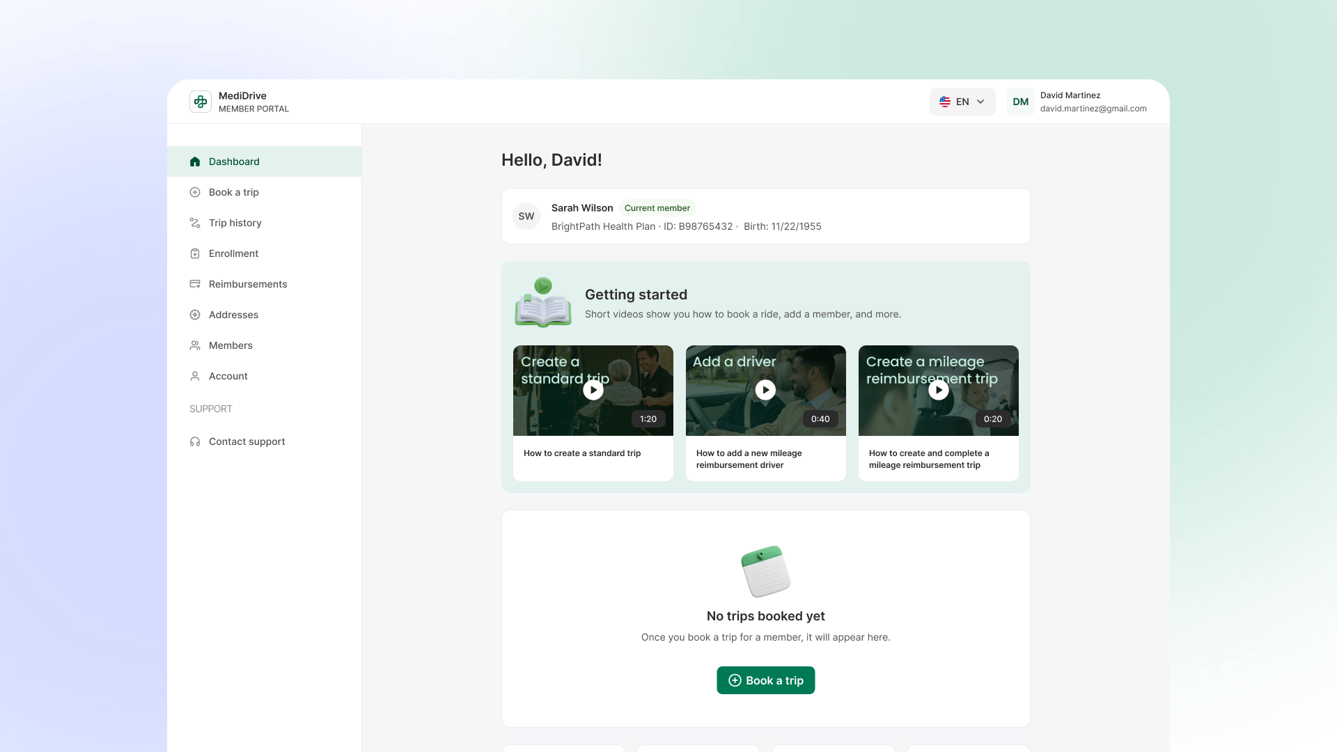
The dashboard answers the highest-anxiety question first, “is my ride happening?”. So most members never need to navigate further. Trip-type selector opens the booking flow
- Problem
- One form for every trip type; return legs re-typed by hand; problems discovered only after submit.
- Change
- The flow opens with a trip-type choice (round trip / one-way / multi-leg). Round trip auto-fills the return leg; one-way removes the return section entirely; fields adapt to the selection.
- Why
- Fewer fields per path, no duplicate data entry, and the form’s shape matches the member’s actual intent.
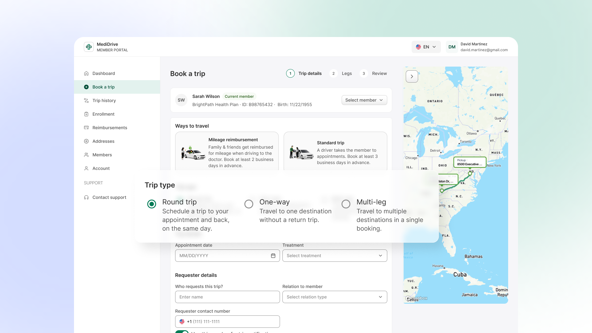
The flow opens with a trip-type choice, so each path shows only the fields it needs and the return leg is never re-typed by hand. Member confirmation before any field is touched
- Problem
- A caregiver or facility staffer booking on behalf of someone found out too late if they had the wrong member.
- Change
- Member identity (Medicaid ID, DOB) is confirmed at the top of the flow.
- Why
- The most expensive error — booking a medical ride for the wrong person — is caught before it can happen.
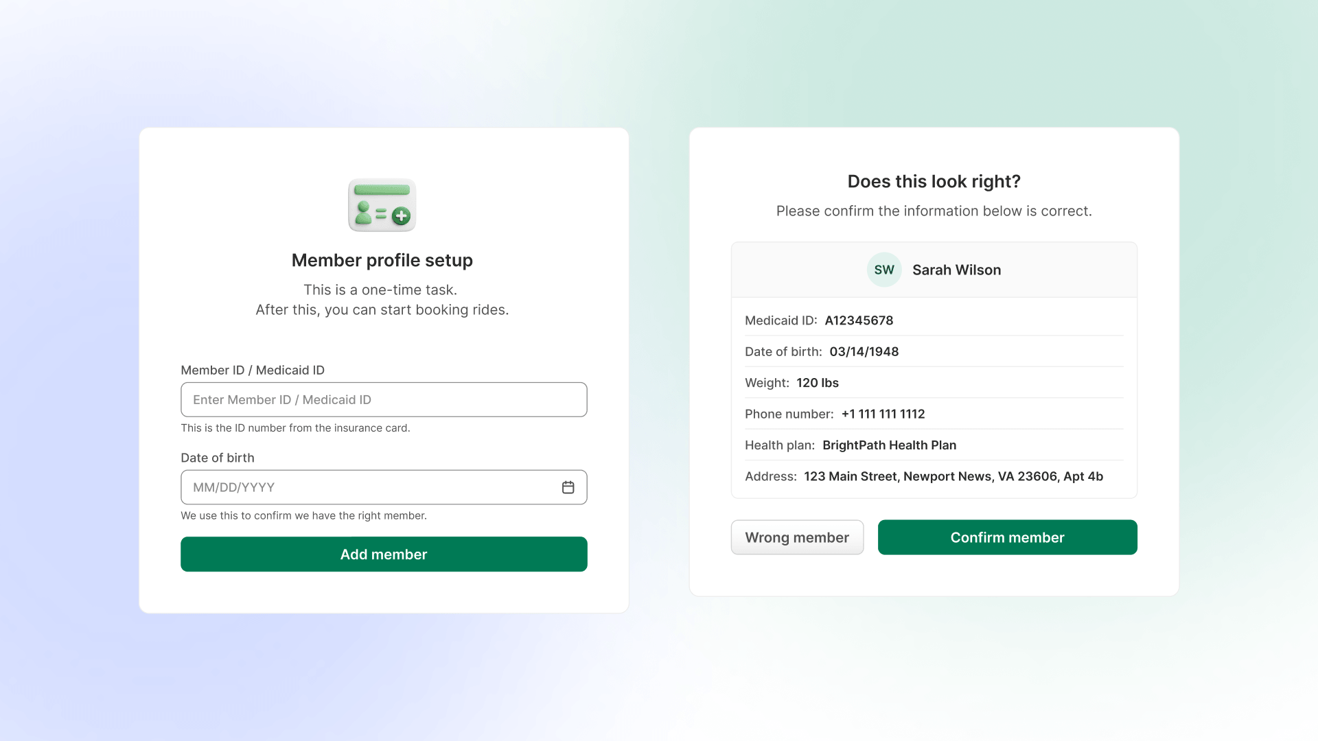
Member identity is confirmed before any field is touched, so the most expensive error — booking a medical ride for the wrong person — is caught up front. Inline, specific error handling
- Problem
- Errors surfaced after submission, generating support calls.
- Change
- Validation is inline and specific at the point of entry.
- Why
- Recovery happens in-flow, matching the prevent-errors and help-users-recover heuristics.
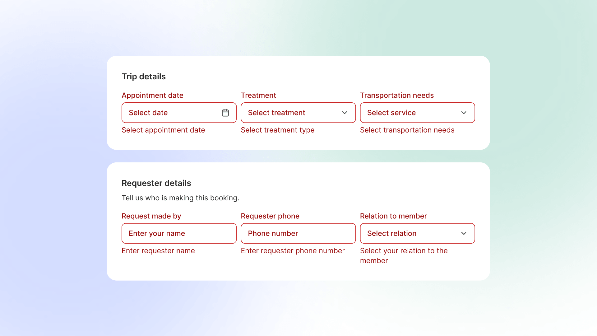
Validation is inline and specific at the point of entry, so members recover in-flow instead of calling support after a failed submit. Trip list rebuilt for the member
- Problem
- The trip layout overview was appropiated to a dispatcher or operational tool. It introduced unnecessary complexity for members and increases cognitive load without adding real value to their core tasks.
- Change
- A table layout it is more intuitive, task-focused and more familiar structure that’s easy to scan and understand, especially for less tech-savvy users.
- Why
- No training required to read your own trips.
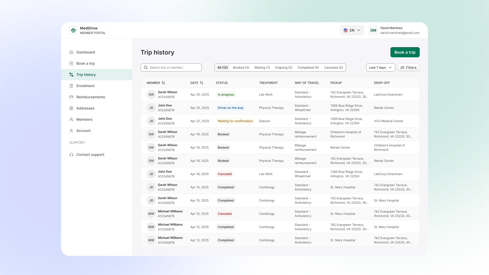
A member-oriented trip list built to be scanned without training — each row is one trip, in plain terms.
Accessibility as risk management
For a Medicaid NEMT product, accessibility is legal exposure (ADA / Section 508), not polish. I treated it that way. And a mandatory request from the states.
- 01WCAG 2.1 AA applied at the token and component level, contrast is a property of the system, not a per-screen check.
- 02Concrete targets: minimum body text size, 44px touch targets, 4.5:1 contrast, and plain language pitched to the member audience.
- 03Design decisions carried the accessibility load so individual builders didn't have to re-derive it.
I made accessibility structural rather than discretionary, so every screen built on the system inherits it by default.
Impact
This program is in progress, so this section states a target and a measurement plan, not achieved results. No number here is claimed as proven.
Primary success metric (target): reduce avoidable, self-service-able support calls by 15–20%. This targets specific call reasons — wrong-member bookings, unexplained booking failures, "is my ride happening?", and login confusion — not total call volume, and it is not an attempt to remove the phone as a channel. For a 65+ Medicaid audience the phone is often the appropriate channel; the goal is only to stop generating calls a member never should have needed to make.
The target is only provable if support calls are tagged by reason code, with a baseline captured before rollout and the same categories tracked after. Naming the measurement condition, rather than asserting the number, is what a numerate reader trusts.