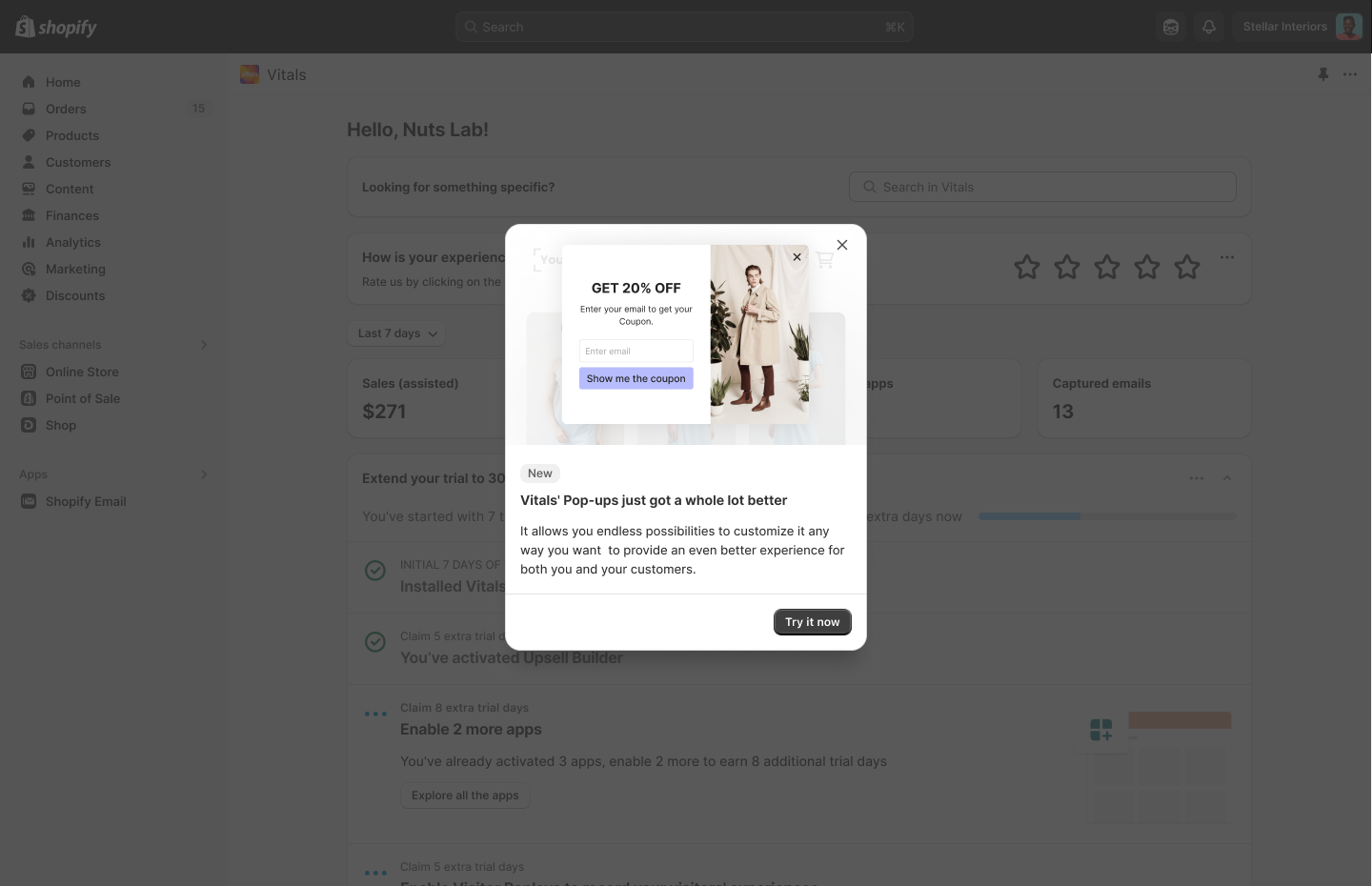
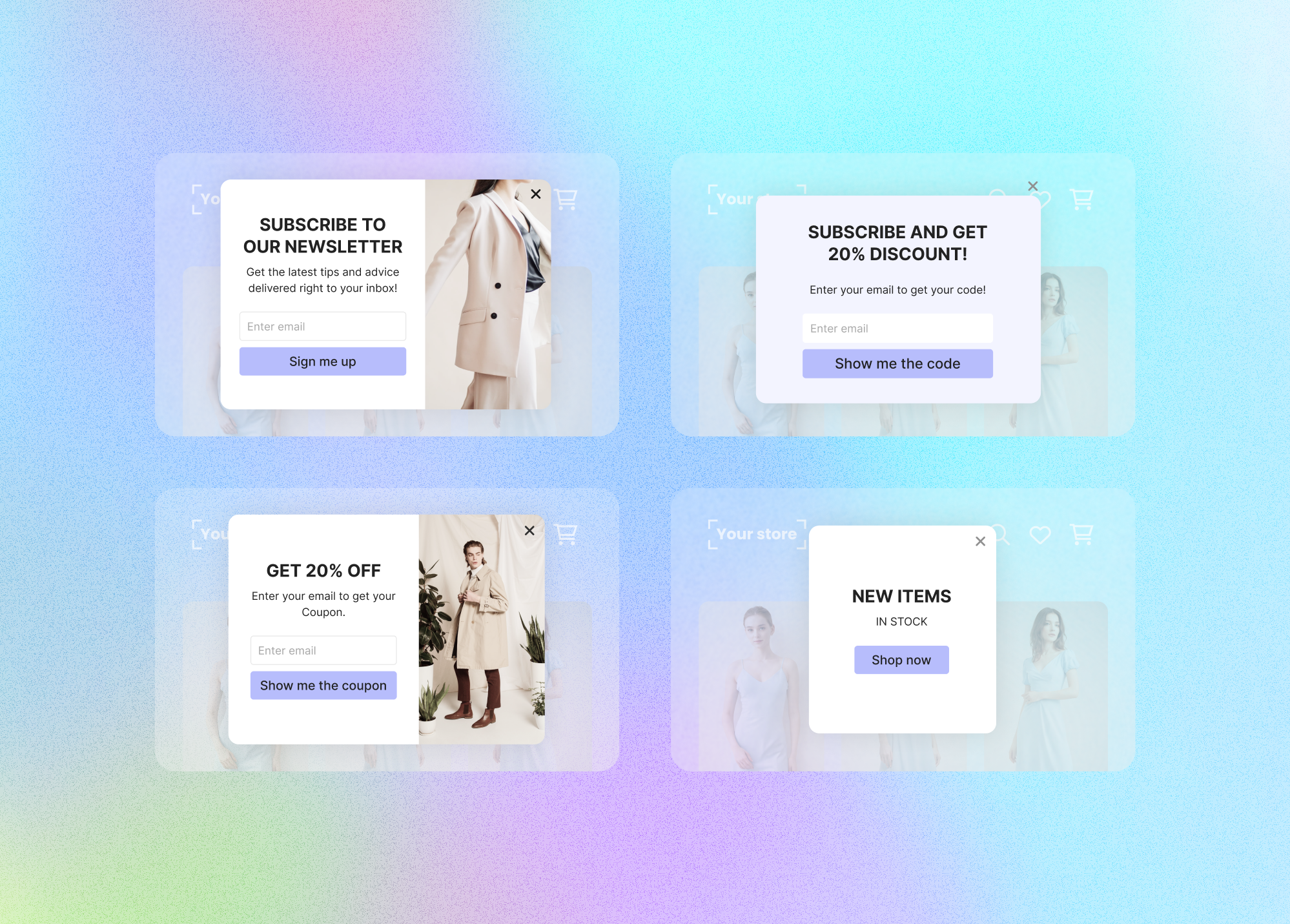
Popup redesign that drove a 10% activation increase
An end-to-end redesign of the Pop-up app — improving usability, accessibility, and conversion for small merchants while balancing scalability and compliance.
+10%
Activation lift
3–9%
Conversion range
3 wks
Research to handoff
The problem
The primary challenge with the existing Pop-up app was its outdated design, which limited its effectiveness and appeal. Merchants were unable to create custom layouts that aligned with their brand aesthetics — particularly the ability to position text on one side (left or right) and images on the opposite side.
Additionally, the app lacked essential features such as the ability to upload and utilize custom images. These limitations significantly reduced the app's value as part of a broader eCommerce strategy.
Research
Through our research, we identified several key reasons behind merchant churn and dissatisfaction with the existing Pop-up app.
- 01Limited customization options: merchants were frustrated by the inability to customize colors to match their brand identity. The app had launched with pre-made templates that, while quick to market, became outdated and inflexible over time.
- 02Image upload demand: the most frequently requested feature was the ability to upload their own images — critical for visually compelling, brand-aligned pop-ups.
- 03Logo integration: many merchants needed to incorporate their own logos to enhance brand recognition and consistency across their store.
- 04Lack of professional design: merchants felt the templates were too basic and unsuitable for businesses maintaining a minimalist, modern aesthetic.
Design process
Our design process began with a competitive analysis of top pop-up solutions and industry benchmarks, revealing that conversion rates can increase by 3–9% on average.
- 01Prioritized an exit-intent trigger, which can recover 10–15% of abandoning visitors.
- 02Made mobile optimization a key focus — mobile-friendly apps can boost conversions by up to 300%.
- 03Set a goal to create the most mobile-optimized pop-up solution on Shopify.
UI/UX design
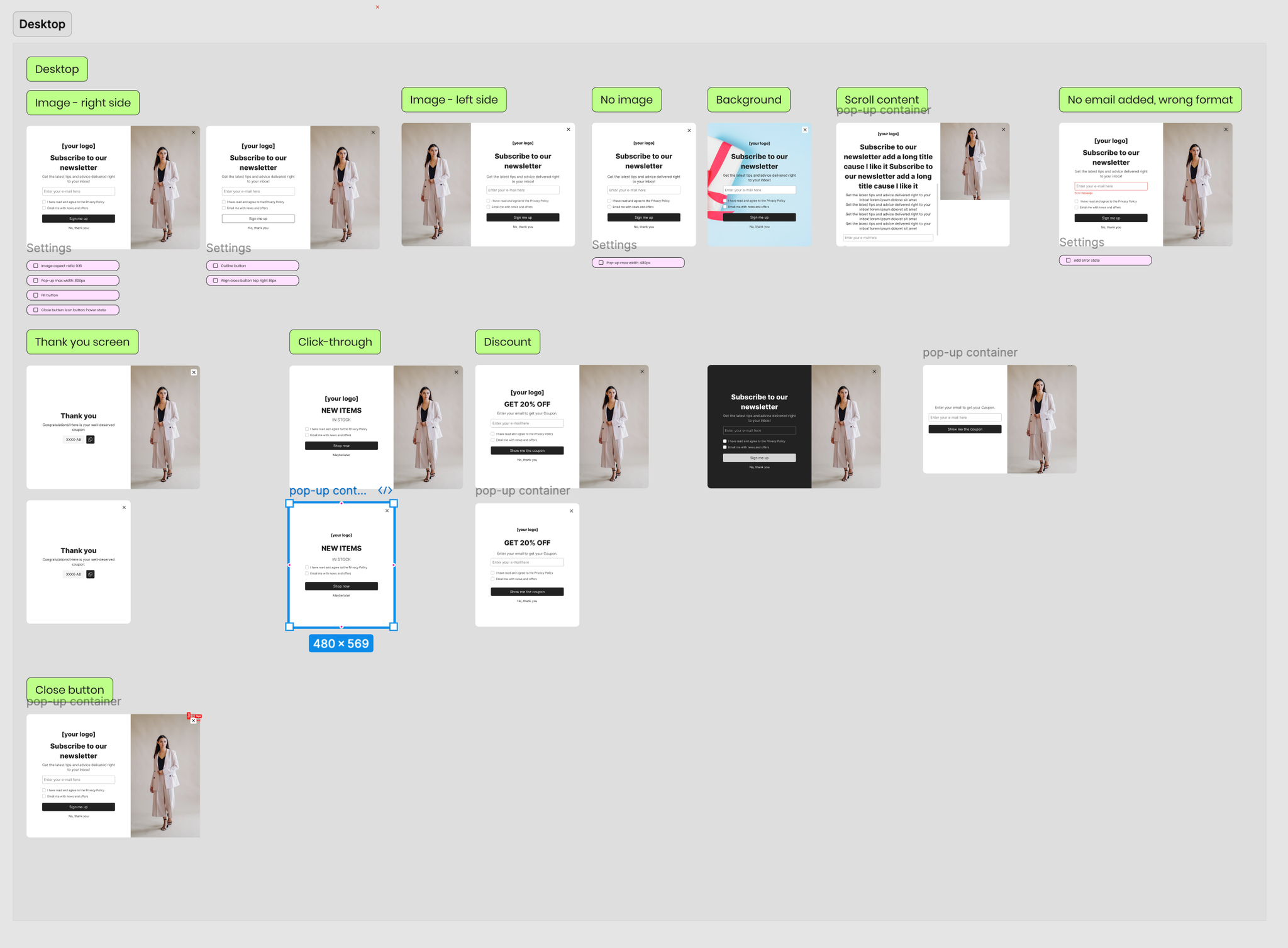
In the UI/UX phase, I created wireframes to define the enhanced user flow, facilitating stakeholder alignment. I then developed detailed Figma screens for both the user interface and storefront scenarios, while the development team prepared a more efficient codebase to support the new features.
User admin design
In collaboration with the Product Manager and the development team, I designed the User Admin interface. Every aspect was discussed and refined to ensure it would be intuitive, user-friendly, and aligned with our goals. The final designs incorporated all the new settings and flows mapped in the wireframing stage.
Key screens from the User Admin interface:
- 01Main interface: a clear, organized layout that lets merchants easily navigate settings and customize their pop-ups, with color customization, image uploads, and logo integration prominently featured.
- 02Customization panel: a dedicated section to personalize appearance and ensure alignment with brand identity.
- 03Live preview: merchants see how changes would appear in real time before applying them to their store.
Storefront design
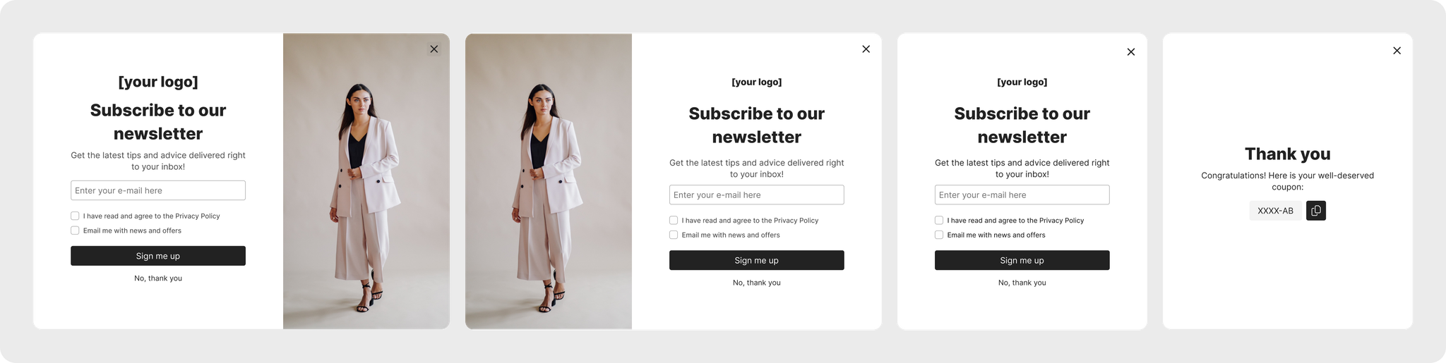
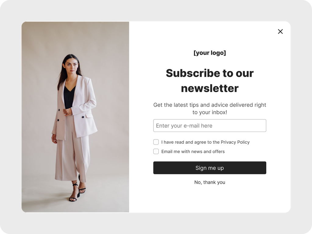
The objective was to ensure the pop-up widget would integrate seamlessly with a variety of store themes while providing a consistent, high-conversion experience for users.
- 01Visual consistency: designed to align with each storefront’s aesthetic — color schemes, typography, and overall design elements — for a cohesive look.
- 02Responsiveness: optimized for desktop, tablet, and mobile, since mobile-optimized apps can increase conversions by up to 300%.
- 03Customization & flexibility: options for placement, animation styles, and triggers (exit-intent, timed delay) to help recover up to 10–15% of abandoning visitors.
- 04Scenarios: from simple lead capture to more complex upsell opportunities, each scenario highlights the widget’s flexibility in driving engagement.
Mockups
To ensure compatibility with various store themes and simplify setup, we designed the app to inherit key styling elements directly from the theme — such as font family for headings and body text, as well as line height. This lets merchants customize and launch in just a few clicks, providing a seamless integration experience aligned with our easy-onboarding policy.
Designing the app to inherit theme styling was the key to easy onboarding — brand alignment without merchants touching a single style value.
One month post-launch
The pop-up widget has shown positive results, evidenced by the uptick in adoption from October onward. Adoption had initially trended downward, but recent adjustments improved user engagement.
The widget is now promoted through two in-app methods:
- 01Product Update Modal — introducing the widget’s new features to users.
- 02“My Apps” Reminder — a prompt for users who have yet to activate the widget.